

Mobile Interface Design
I designed, wireframed, prototyped, and presented the company's mobile browser interface.
I collaborated with their Product and Engineering team, which developed and implemented my designs for their users.
Here is a demonstration of my prototype:
My job was to adapt the features and overall look of desktop browser to fit on a mobile device. Because the company handles financial information, it is important for the website to be accessible on the go, especially for solo entrepreneurs who are busy and need readily accessible finances. It also needed to be usable for people who aren't necessarily familiar with technology, so the interface needed to be simple. I worked closely with the Products and Engineering team to create 5 iterations of the interface design, meeting frequently to discuss design choices and apply feedback.
First, I studied the different "rules" for effective mobile interface design, and gathered some important notes about minimizing popups, limiting the distance that the user's fingers must travel on the screen, keeping clickable elements at a comfortable size for fingers to tap, and limiting the amount of pages that users had to click through.
Wireframes
1. Sketches
My first step was making wireframe sketches. With these sketches on Notability, I wanted to design all of the important features of the website to give myself a rough draft to work with and get robust early feedback from the team.

2. Figma
Next, I translated the sketches into Figma, keeping them grayscale to ensure that my interface would be legible and easy to navigate without the visual aid of color. I focused on the visual hierarchy and overall layout. Here is the first wireframe iteration:

The next iterations added complexity and specified how elements would be interacted with, such as popups. I adjusted specific features, like adding documents and editing user messages, based on user and team feedback. Here is the fourth wireframe iteration:
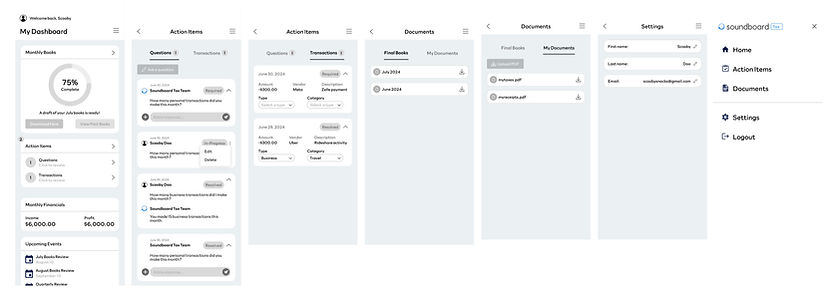
Prototype
After many rounds of feedback and cross-functional team collaboration, I prototyped the interface functions and behaviors on Figma and added color. I needed to represent the pre-existing aesthetic and color palette of the company while also keeping the experience visually interesting and legible. I added banners and shadows to increase texture and contrast without adding noise. I finalized the popups and linked them to button click interactions on specific elements. Seeing it all come together was the most rewarding part of the process for me.
I presented the prototype to the company and got great feedback on it. The Product team used my prototype to implement the mobile version of Soundboard's product.
Takeaways
This project was really fun and engaging. It was a creative challenge to translate the company's product to a phone screen and adapt to the limitations of mobile dimensions and usability. But by applying design solutions and adapting to different challenges, I was able to prototype every important feature while keeping the overall design concise and legible. An important lesson that I picked up while wireframing was consistency. If I changed the height or adjusted the distance between elements, I needed to apply those changes to every other similar element. The borders, padding, and distances needed to be predictable values and complement each other stylistically. I learned to keep a rigid eye on technical consistency while letting my creative intuition flourish. Overall, this project was a great exercise of balancing design intuition with technical skill.
I built upon my design, collaboration and presentation skills. This was my final project with Soundboard and it was a great conclusion to an already amazing experience with the company.
